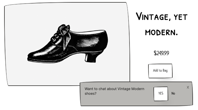
When you added that chat widget, you placed it unassumingly in the bottom right of the user’s screen:

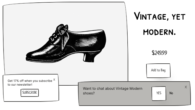
So when you decided to try out that discount-for-email-opt-in widget, you put it safely in the bottom left:

Plenty of space left over for visitors to read your amazing copy, marvel at your striking visuals, click your irresistible buttons.
Except on mobile.
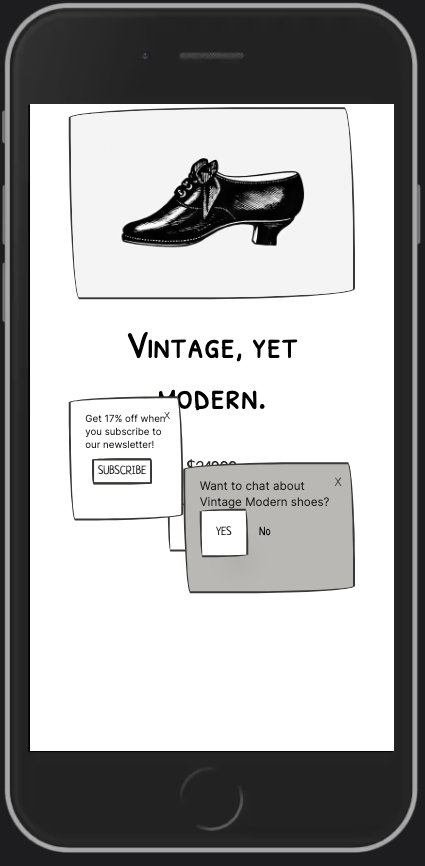
On mobile, your various widgets are scrunched together till they take up 57% of thumb-reachable screen real estate. Which sucks for visitors who don’t want to engage with the widgets. Which is most visitors.
There’s a slippery slope between “annoying to the users” and “costly to the business.”
And that slope gets extra steep where the widgets meet a button or link that’s tied to revenue.
Like, say, Add to Bag:

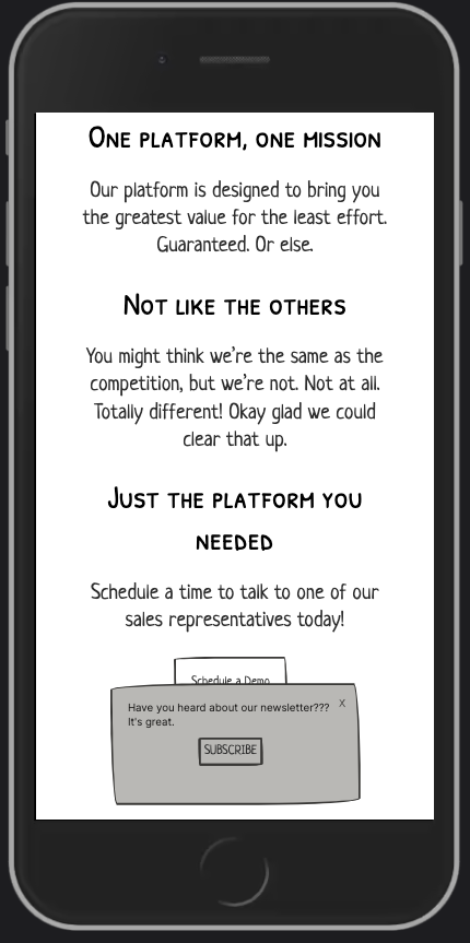
or Schedule a Demo:

Covering up these buttons is like putting yellow police tape around your cash register and asking customers to crawl under it. It’s like answering a sales call and saying “oh hey thanks for reaching out, lemme put you on hold for a minute.”
Some people will deal with it. It won’t drive your revenue all the way down to zero. But it sucks.
Here’s how to fix it
Decide what these widgets are actually worth to your business.
The most rigorous way to find out is an A/B test that removes the widget for 50% of visitors. You might also just try turning it off for a month to see if anything drastic happens.
Then, choose one of the following options according to your comfort level:
- Remove the widgets from the site entirely
- Remove the widgets, but add the corresponding functionality to the navigation
- Remove the widgets on pages where conversions happen
- Remove the widgets on pages where conversions happen, for mobile visitors only
- Minimize the widgets on pages where conversions happen, for mobile visitors only